The client, Impactivo Consulting (2013), is a social impact firm that specializes in the field of healthcare, childhood, education and philanthropy.
 They wanted to pick up suggestions from their users as to improve their children website.
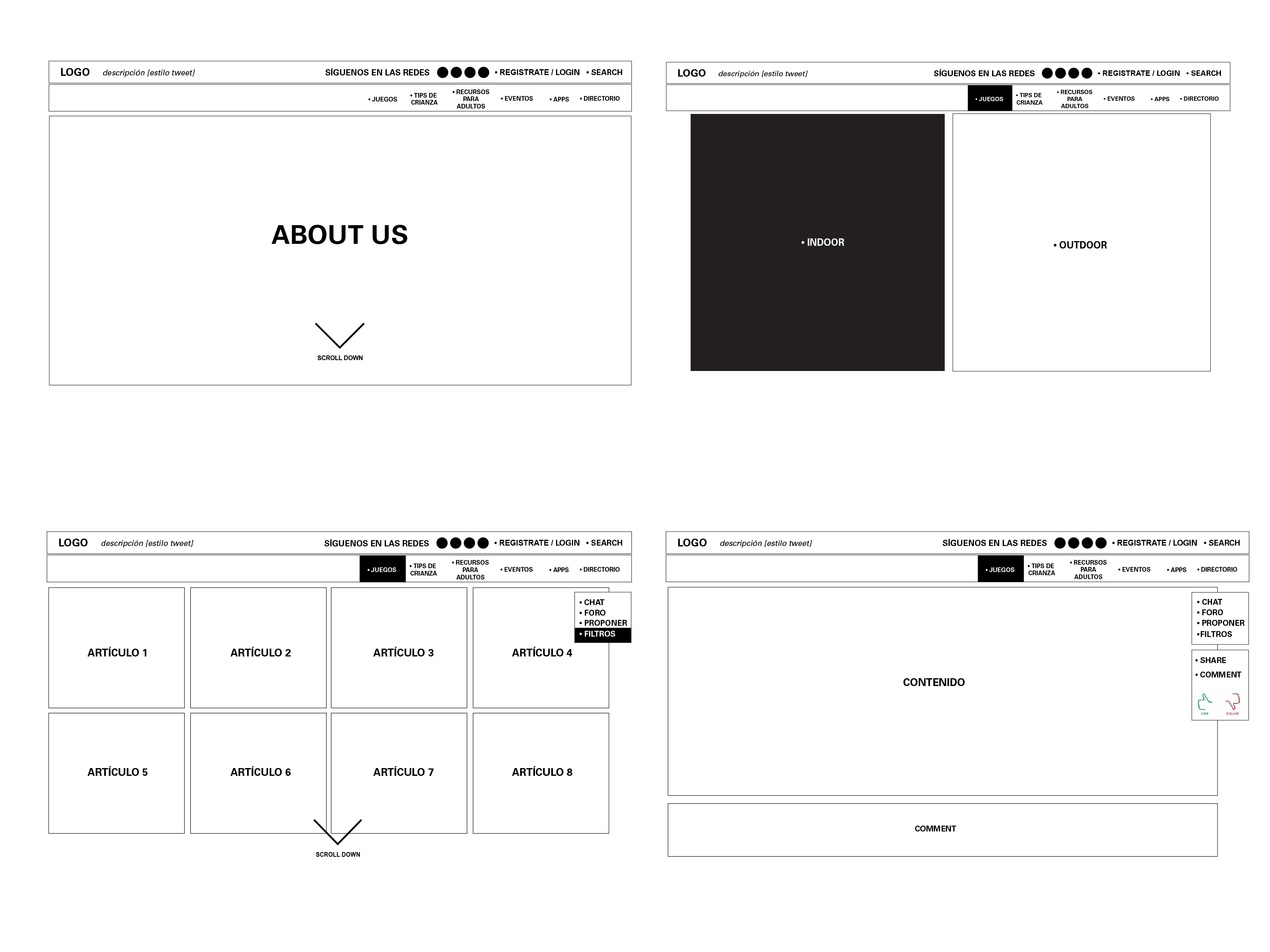
We inquired about a new possible interface navigation based on the perspective of the users.
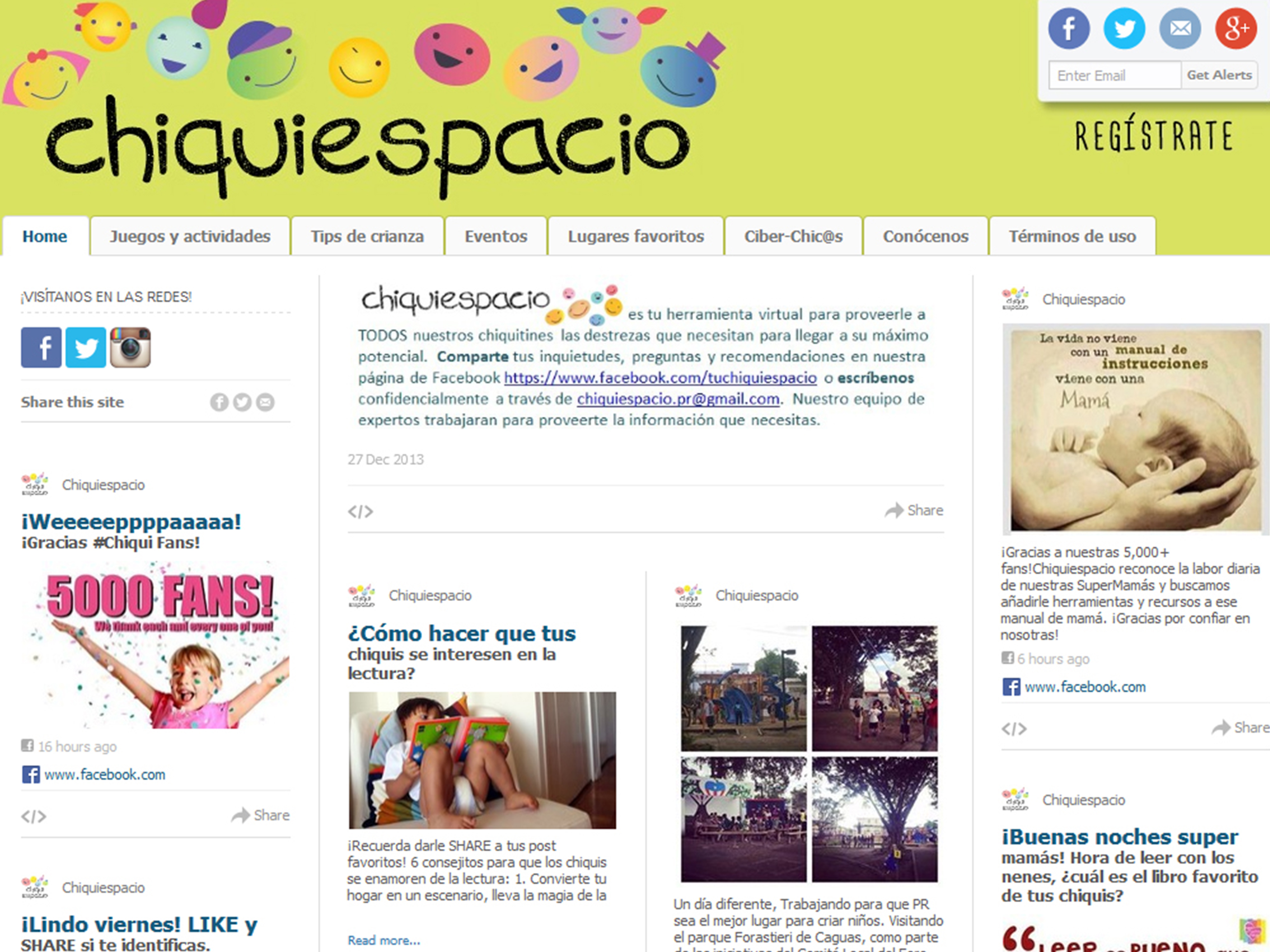
![]() Impactivo Consulting wanted to audit a children’s website they had recently launched. Chiquiespacio aimed to become a community of knowledge for parents concerning the education of their children.
Impactivo Consulting wanted to audit a children’s website they had recently launched. Chiquiespacio aimed to become a community of knowledge for parents concerning the education of their children.
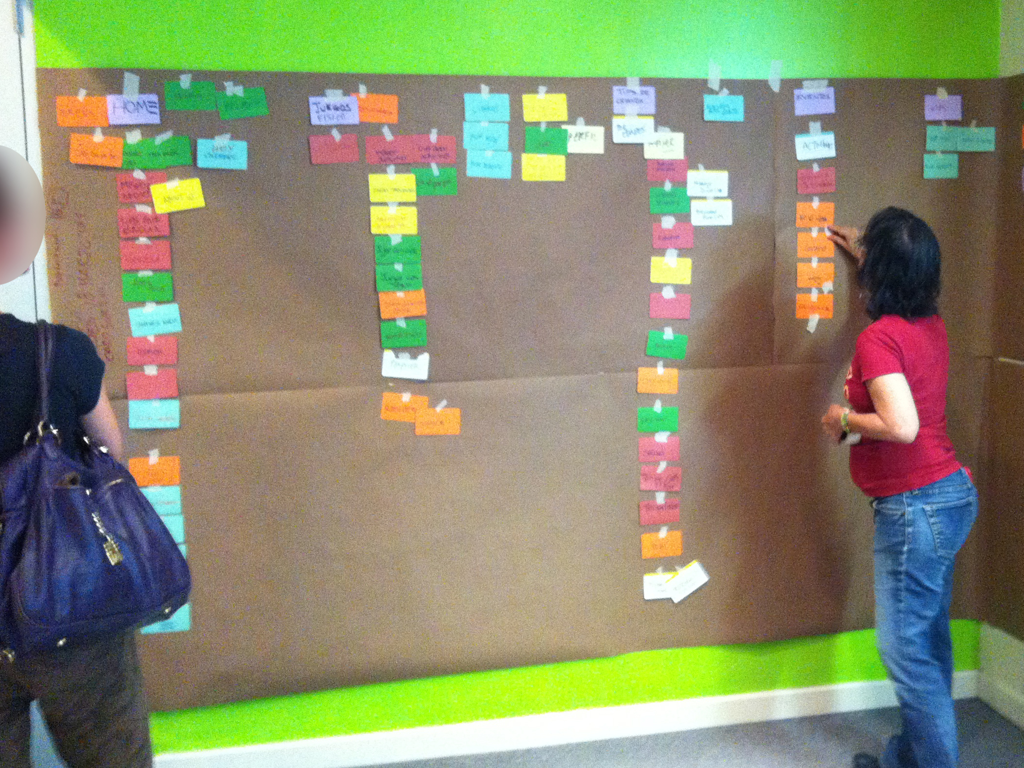
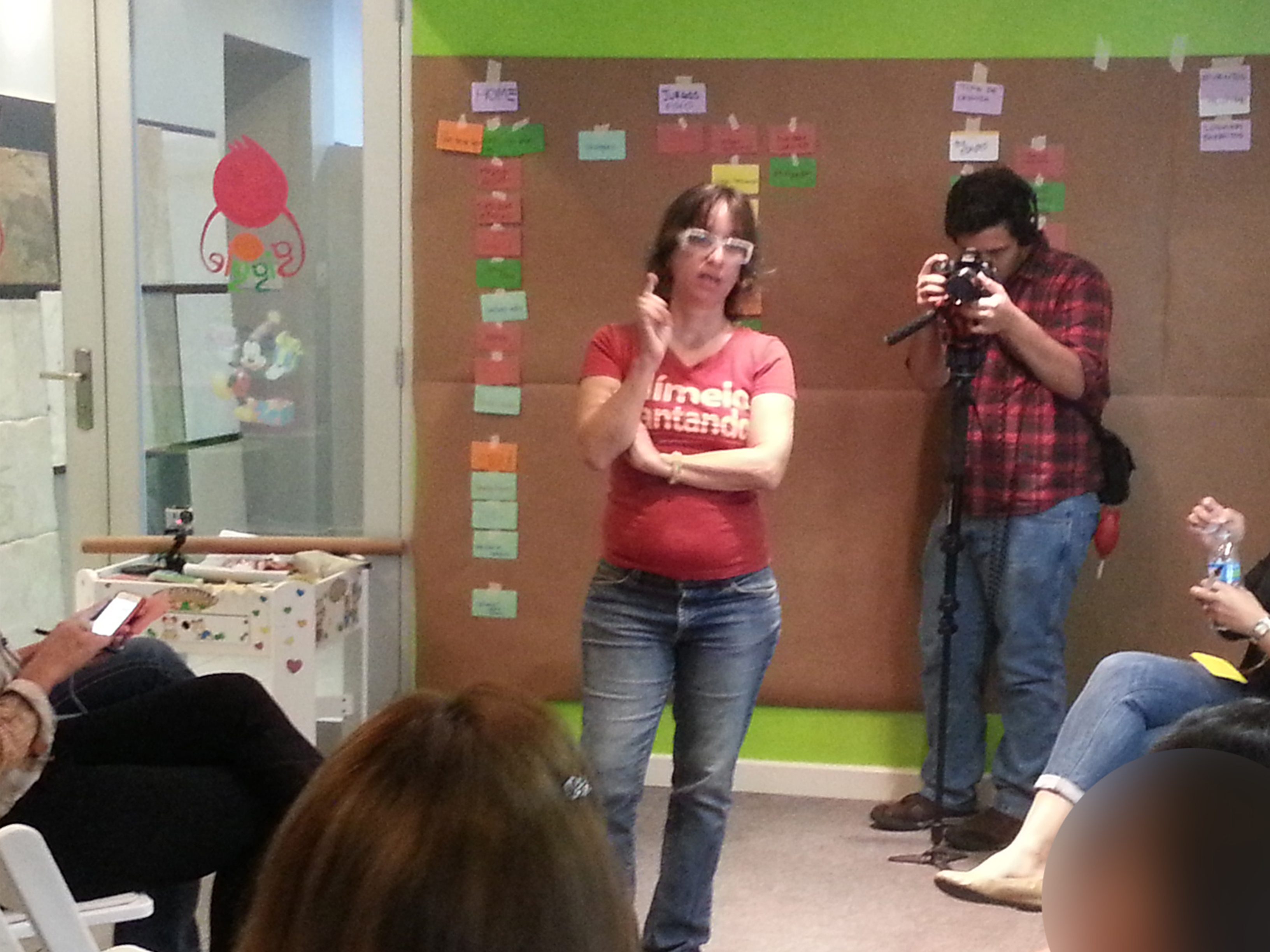
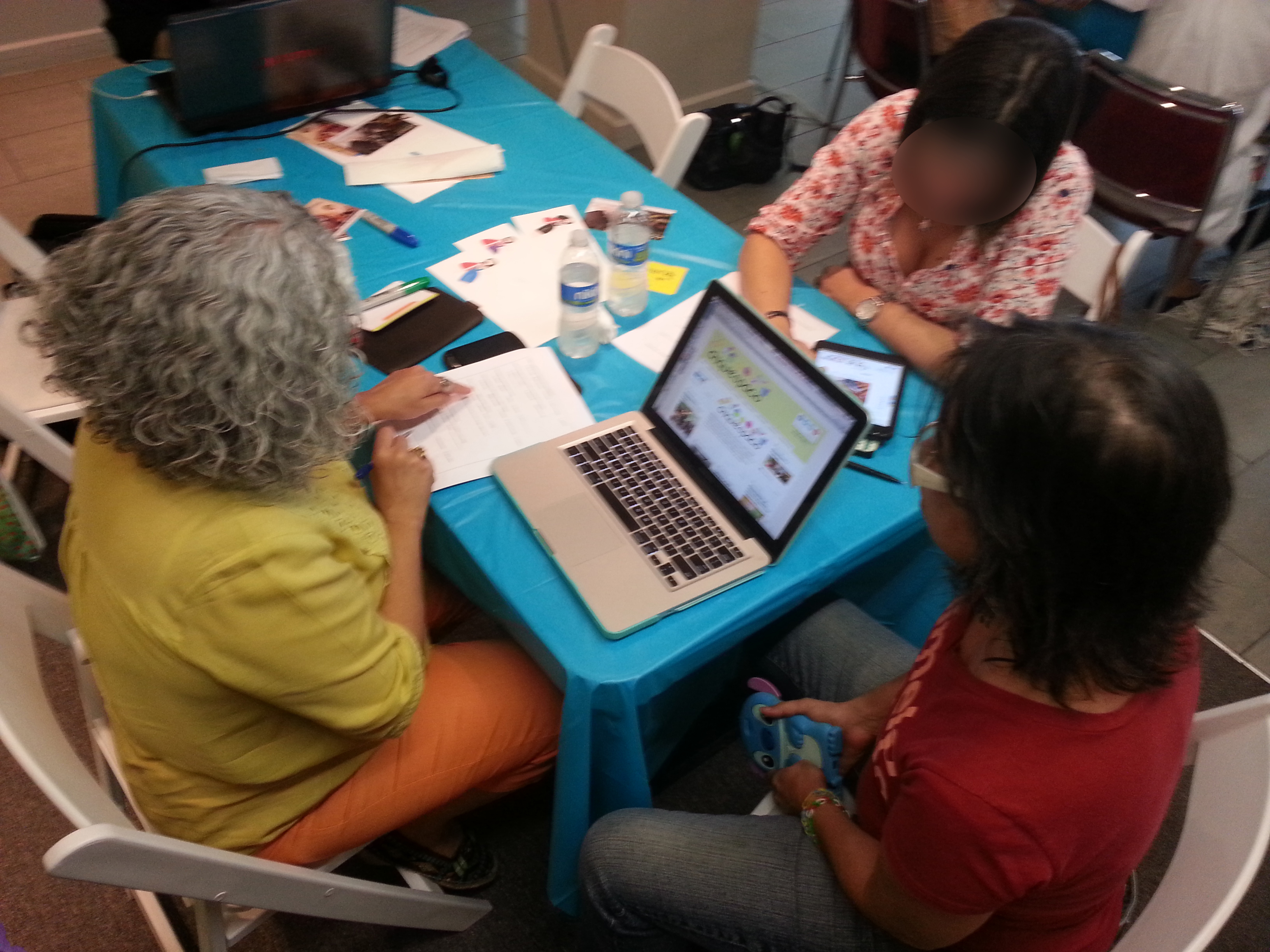
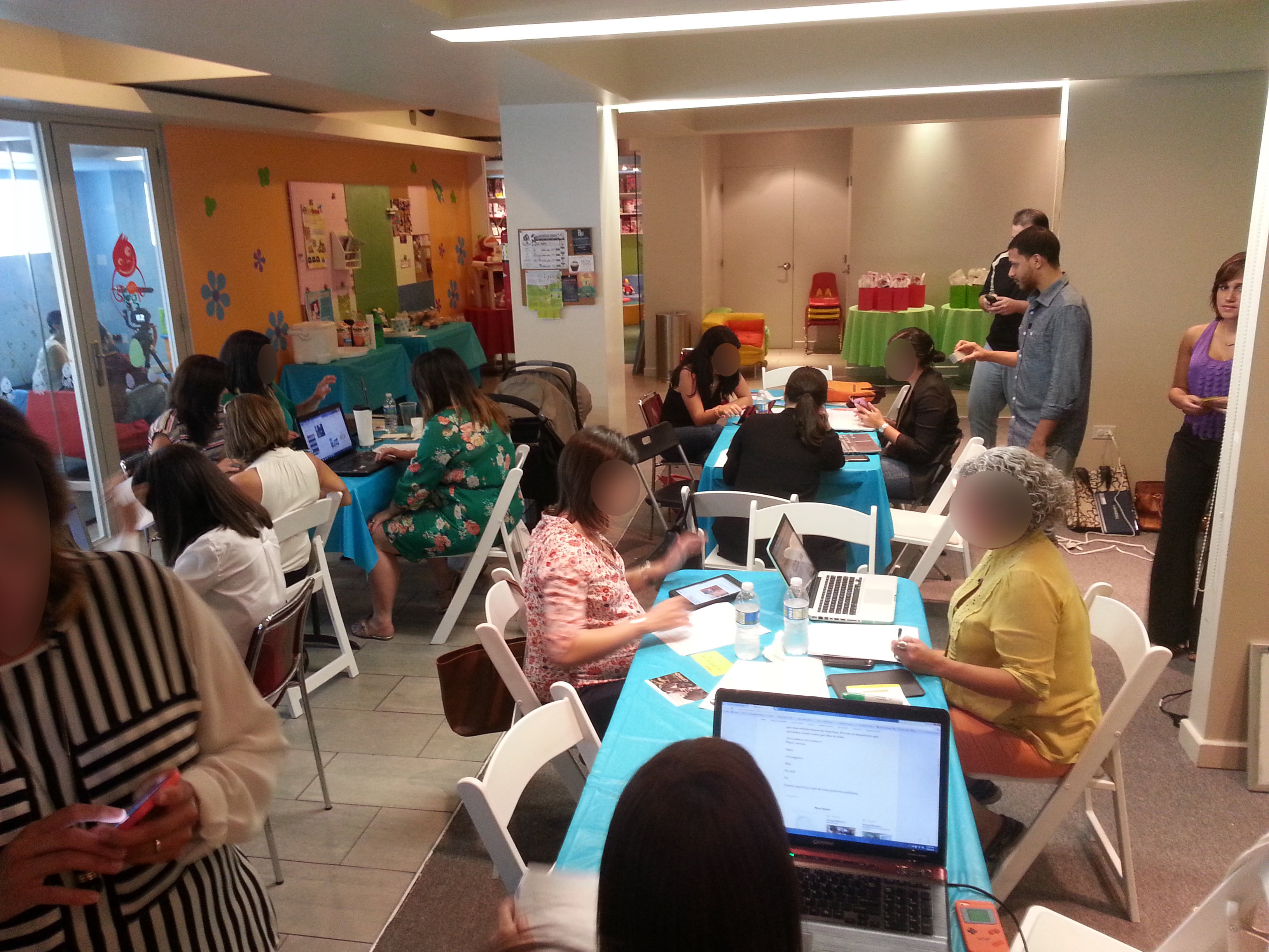
We approached the task by co-creating hierarchies and sequences of topics; together with the users, we were able to identify what they wanted to access first and their desirable journey through the website. We achieved this in a morning session.
We then used these insights to establish design strategies, and suggested new ways to organize the information according to the actual experiences of the website’s readers.
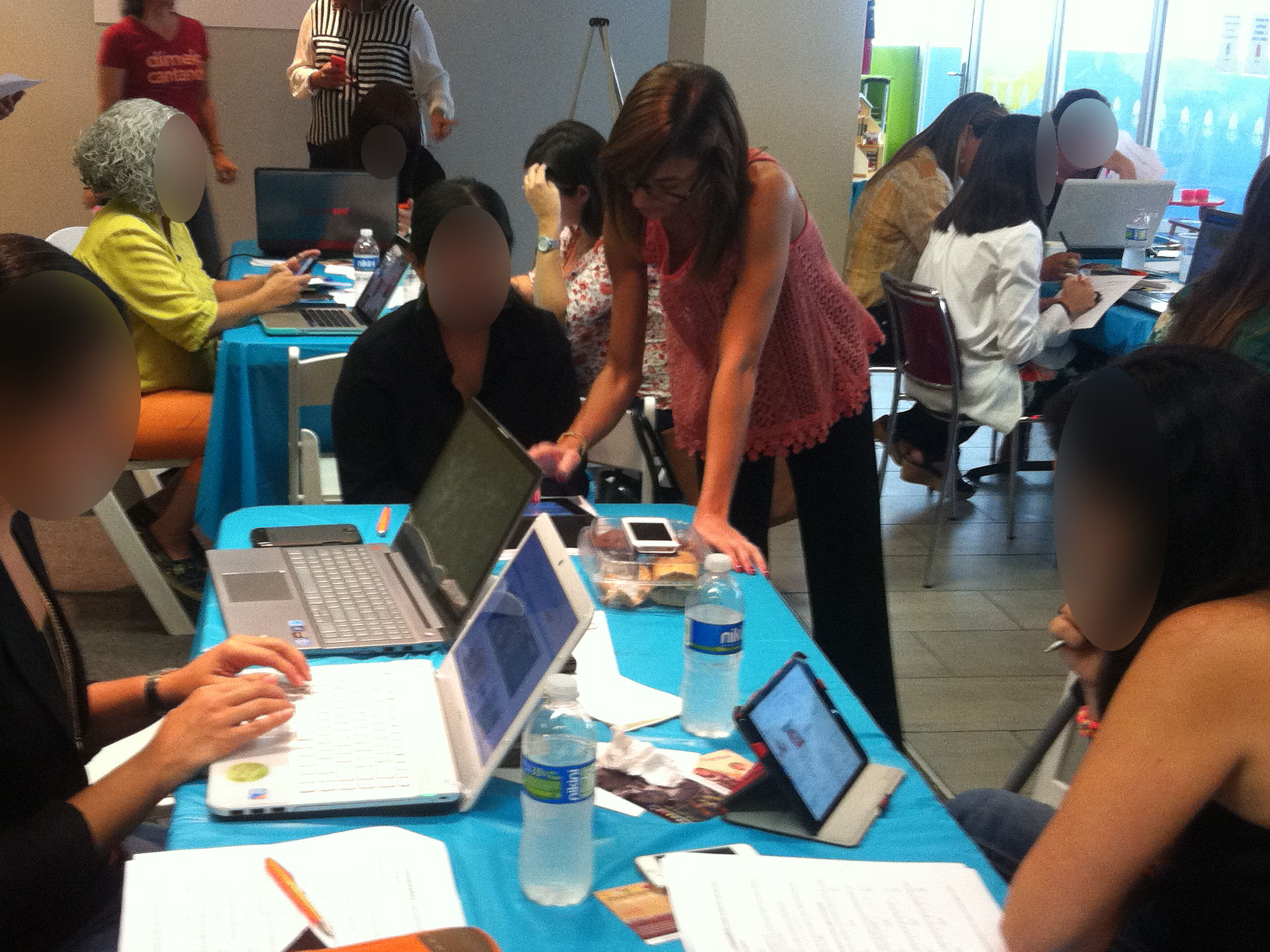
Usability testings and card sorting were the methods used for this inquiry. Our proposal was responsive to mobile devices, and was based on pockets of information and user preferences.

