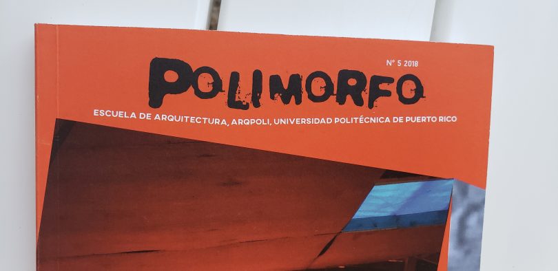
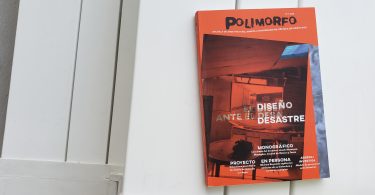
Polimorfo, academic journal for the School of Architecture, Polytechnic University.
 Publication Design 2018.
We conceptualized and developed visual communication strategies (copy-writing, photography, design and production).
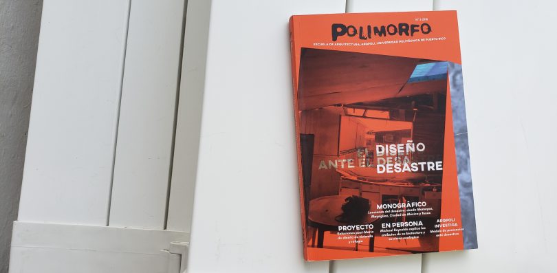
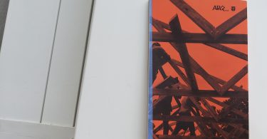
![]() In 2018 we designed two publications concerning Hurricane María impact in Puerto Rico. One was an annual report for the law office Servicios Legales de Puerto Rico (SLPR) and the other one was the academic journal of ARQPoli, the School of Architecture of the Polytechnic University of Puerto Rico.
In 2018 we designed two publications concerning Hurricane María impact in Puerto Rico. One was an annual report for the law office Servicios Legales de Puerto Rico (SLPR) and the other one was the academic journal of ARQPoli, the School of Architecture of the Polytechnic University of Puerto Rico.
For the SLPR annual report we focus on the storytelling approach from the perspective of the lawyers, that despite the catastrophic events that affected them, the show up for work. In term of Polimorfo, the approach is more theoretical, how design can or can’t be a successful way to respond to disaster.
The initial brief for Polimorfo, before the hurricane, was to improve motivation for designers, design students and scholars to read the journal, by making it more visually attractive. It also considered the possibility of rebranding. After the hurricane, the initial brief stated, but more emphasis was given to the catastrophic event.
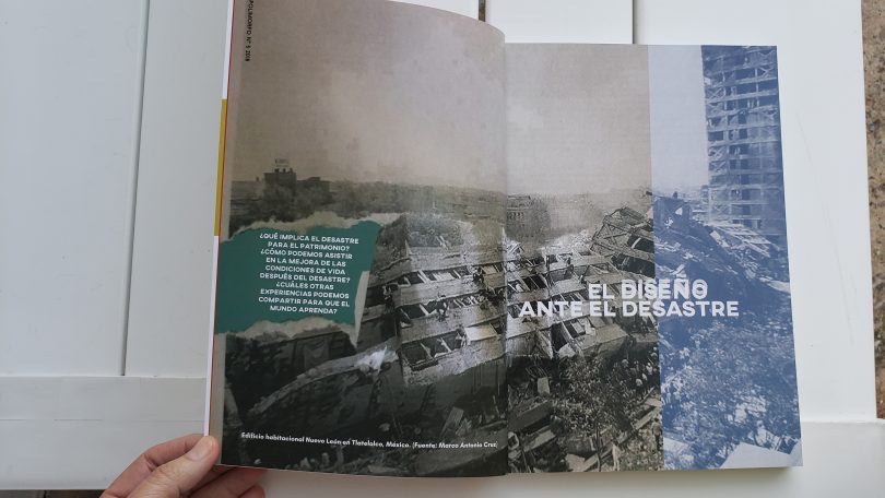
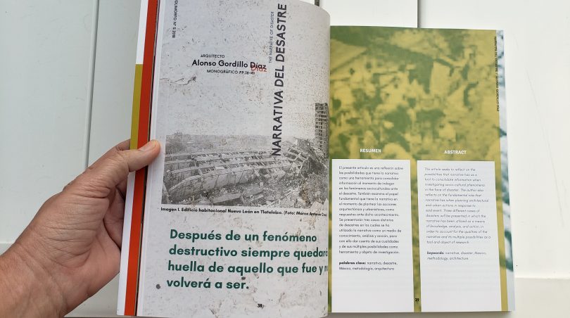
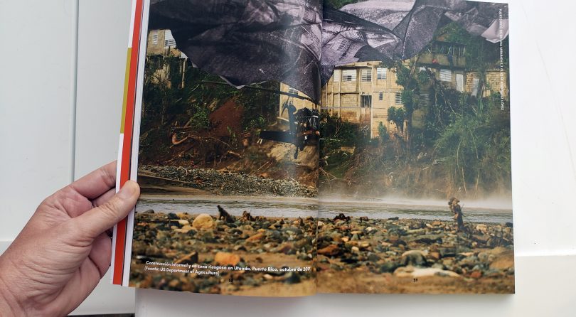
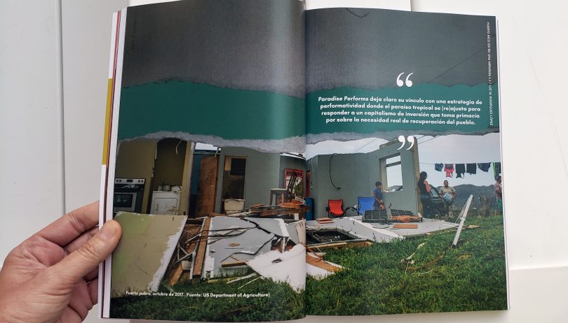
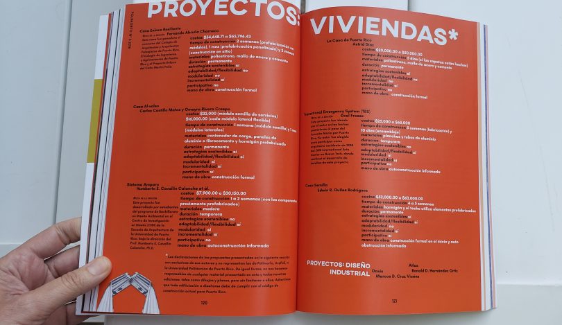
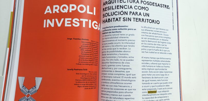
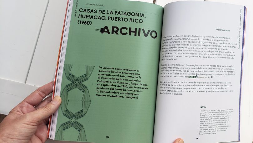
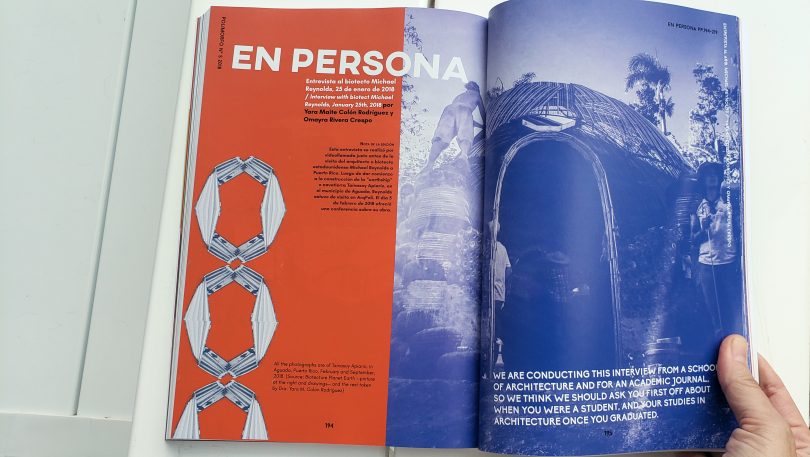
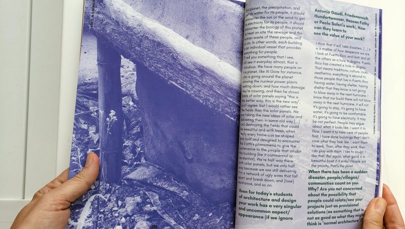
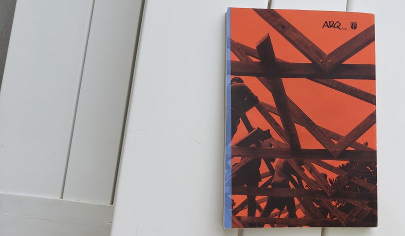
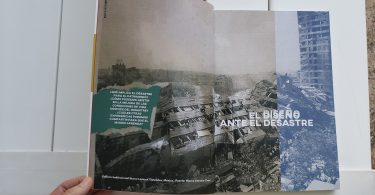
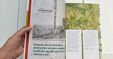
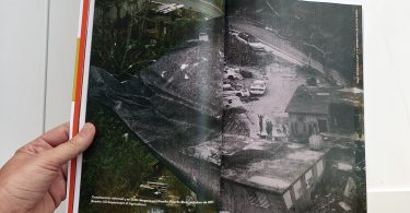
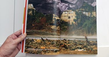
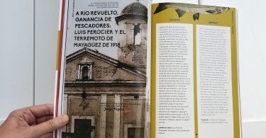
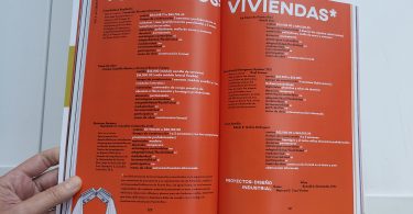
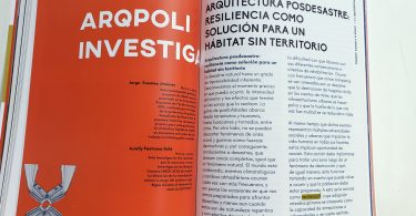
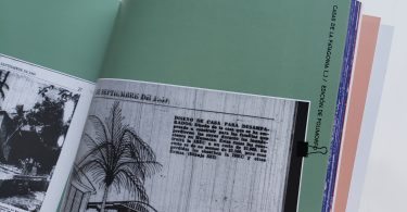
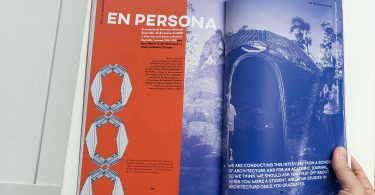
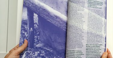
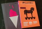
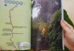
At Rubberband we proposed to the client an approach of chaos design (paragraphs, sentences, all rotated a bit or moved from the baseline, as well duplicated photograph) and used risograph visual look as a chromatic approach. The reason for this was that we were pursing a look that had the made by hand language and not by digital means. It brings an error and dirtiness look that was pertinent to the theme. Photographs were intervened, printed in black and white and then riped off, then used as collage with the original color photo. The paper ripped off was a reference to the destruction of the wind. All this added to the visual anarchy.
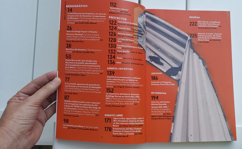
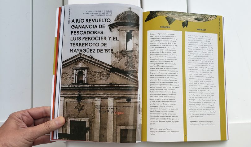
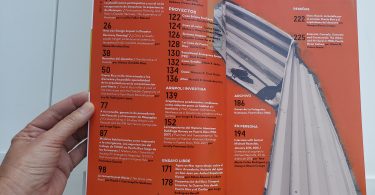
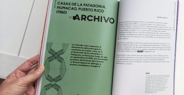
In order to tackle the issue of the lack of reading scholastic papers, we proposed that each paper had a distinctive visual language, that color were used as sections category (papers, reviews, dossier, interviews, among others). The choice of typography was also considered for being contemporary, edgy, but legible, since they were used with color. The metal zinc roof, that many houses had in Puerto Rico (therefore destroyed), was used as Leitmotif, not only at the table of content, but as a pattern in each section.
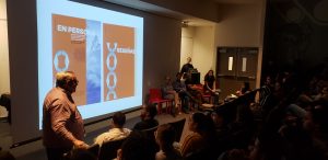
The editor, Dra. Yara Maite Colon Rodriguez said at the journal presentation:
“The general idea that guided the entire exercise of visual communication was to provoke in the reader the sensation of uneasiness, disorientation and disruption that we experienced after the most recent disaster in Puerto Rico (Hurricane Maria). Why put the reader in that situation and how to do it? Placing the audience in that position allowed to visually guide the issues and problems that would be addressed in the magazine. This was achieved through the allusion to tearing, breaking and destruction and through the exploration of production techniques such as serigraphy and risography, which, in their handcrafting process, clearly record where and how uncertainty is produced. The collaboration was a rewarding process of long and intense dialogues and great learning.”
Some of these solutions will be used as a revamp for branding the journal in this coming year (2019). But we do think, that this edition, is a special one. Designing about the hurricane was challenging, because we wanted an attractive piece, but being aware that disaster is not beautiful.

